
Internet Of Plants
Part 2 - Data Analytics
Intro
In my previous blog (Internet of Plants - Part 1), I explained how sensor data was provisioned to a data intelligence platform, Azure Databricks, for monitoring plant happiness. With a couple of sensors I measured some environmental properties to studie under which conditions my pancake plant grows the best. More details about the infrastructure and configurations can be read in there.
After polishing and trending the data the result can be seen below. In this blogpost I will explain how to make sense of this data, which tools and platforms are used and what are the typical challenges to overcome.
Recap of the objective
Before we dive in, I’ll briefly recap the objective and hypotheses that were formulated. The target function was maximum plant happiness or maximum in CO₂ fixation rate.
The hypotheses that we want to test are:
Changes in CO₂ concentration is expected to be different during the day vs during the night due to respectively photosynthesis and respiration.
It is expected that biochemical reactions go faster when temperature is higher.
Data Exploration
Continuing from my previous post, I dive deeper into the time series data we've collected. In this example you don’t have to be a statistician to get some first insights and test some of the formulated hypotheses. However, data preparation, cleaning and visualisation techniques are crucial for developing a comprehensive understanding and presenting findings more effectively. Let me walk you through.
The upper trend represents CO₂ levels, which fluctuate significantly before January 4th due to external disturbances such as breathing, cooking, and ventilation. "Ceteris paribus" - Latin for "keeping all else equal" - is a fundamental principle in scientific experiments when investigating the effect of one variable on another. It's important to keep other influencing variables fixed to avoid introducing bias. Therefore, I isolated the plant in a closed transparent box.
The moment the box is closed, a clear response can be observed in the bottom relative humidity trend, which sharply rises from 50% to 75%. Consequently, all data before this point is filtered out and should be disregarded in the analysis.

Figure: Closed system set-up to exclude external disturbances
In this experiment all raw data is stored without any compression, at a frequency of one datapoint per second. In industrial applications with thousands and thousands of sensors this is often not feasible and smart compression algorithms are applied to save resources and costs.
Commercial time series databases like data historians offer this functionality typically out of the box. Alternatively a swinging door trending (SDT) or deadband compression algorithm could also be implemented with only a few lines of code in open-source database management systems for free.
In the animation below, I explain how such an algorithm could work by simulating some time series data. Basically, points are only stored when the direction of a new point is significantly different compared to the last few points. In this example little information is lost using only 41% of the original samples.

Figure: Simulation of swinging door trending (SDT) compression algorithm.
Data cleaning
When dealing with time series data, a second useful step is to remove noise and outliers. Noise and outliers are artefacts that do not contain useful information and can significantly distort your findings.
Data cleaning is a critical yet often overlooked stage in data analysis. This tedious job is fundamental to generate reliable insights. The principle "garbage in, garbage out" underscores a key strategy: be conservative when filtering data. It's strategically wiser to exclude some relevant data than to risk of contaminating your analysis with questionable information.
Figure: Comparison of raw data compared to cleaned signal where questionable data is removed.
Data Quality
Before running some fancy analytics, it’s important to first assess the quality of your data. There are many things that could go wrong when registering, transmitting, and transforming your data. The goal is to check wether the property you want to measure is correctly represented by your data in a continuous fashion. Ideally these data quality issues are prevented and mitigated upstream by implementing checks and balances in your data pipelines proactively.
There are many different ways to cope with bad data, my recommendation is to keep it simple and approach this pragmatically. The best data quality assessment is by visualising your data and try to make sense of it. Look for dat gaps, sudden jumps which cannot be explained, look at the variability to assess the precision of your data, when you have an external source you could also check the accuracy and calibrate or correct the data when there is a consistent off-set.
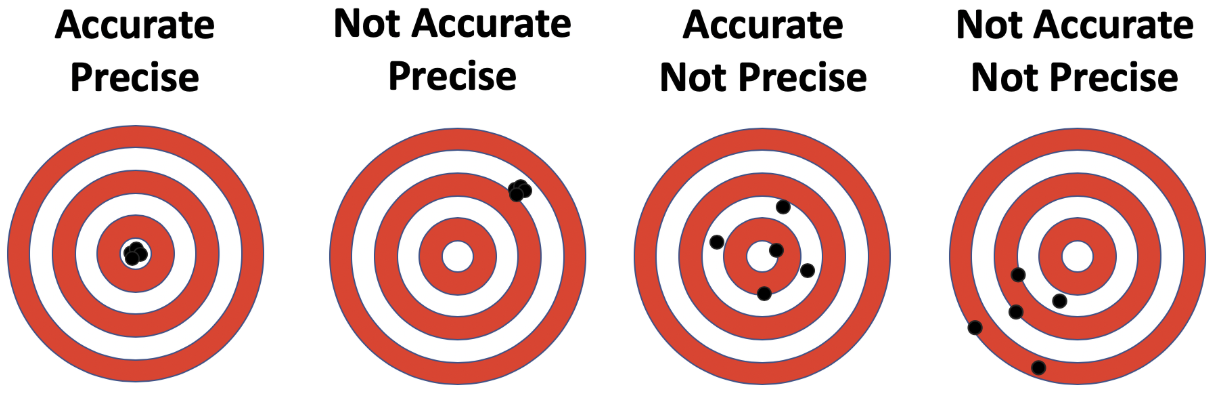
Figure: Difference between accuracy and precision
Understanding the underlying measurement principles is also helpful in data science. Certain properties like flow, temperatures, level, or concentration can be measured using various techniques. For instance, mass flow measurements using a venturi or a coriolis meter involve different measurement principles. The coriolis meter inherently adjusts for fluid density, while the venturi meter requires external temperature and pressure compensation to ensure accurate readings.
While evaluating the ENS160 sensor, which is used to measure the CO₂ concentration in this experiment, I discovered its limitations after reviewing the data sheets:
It doesn't directly detect CO₂ molecules.
Uses metal oxide technology to measure oxidised volatile organic compounds (VOCs).
Relies on a 150 year old correlation established by our German friend Max von Pettenkofer*.
*Notably, he's famous for establishing the "Pettenkofer number" - recommending 1000 ppm of CO₂ as a hygienic limit for indoor air quality, a standard still used worldwide today.A more suitable alternative for plant performance measurement would be a non dispersive infrared (NDIR) spectroscopic sensor, which directly measures CO₂ absorption in the infrared spectrum.The ENS160, while showing strong correlation with CO₂ levels in low-VOC environments, is primarily designed for air quality assessment using CO₂ equivalents (eCO₂). This makes it less ideal for precise CO₂ measurement.
Despite these limitations, I'll proceed with the available data to demonstrate data analytics and visualisation techniques, acknowledging the constraints of using what is essentially a sophisticated "fart detector"…
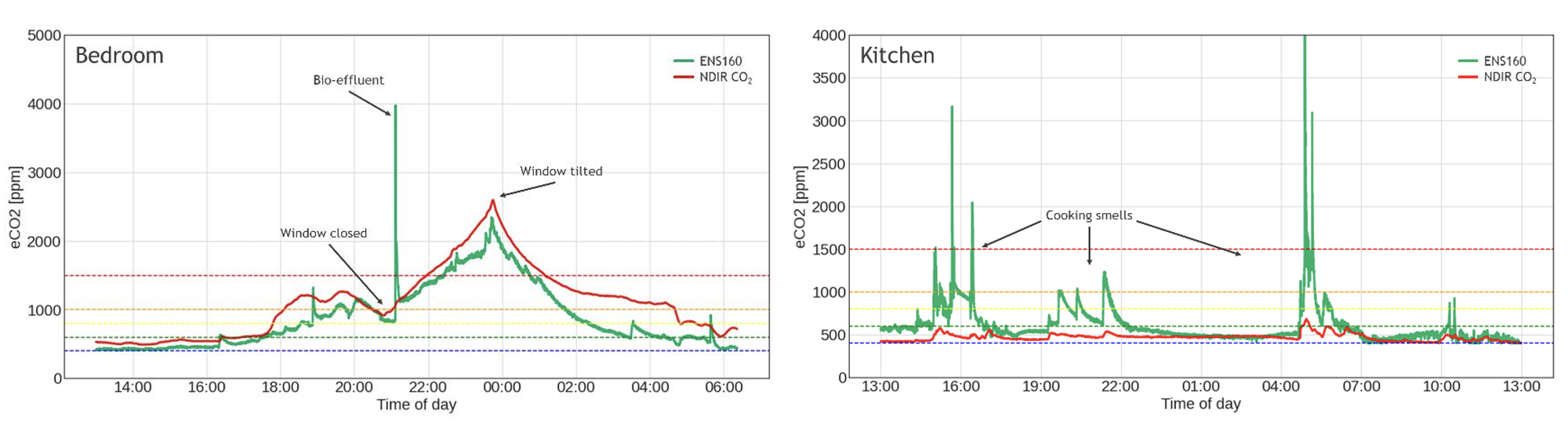
Figure: Difference in CO₂ sensitivity between NDIR spectroscopic and the ENS160 metal oxide sensor (source: ENS160 sensor data sheets)
Data Analysis
There are different ways to test your hypotheses. Mathematicians prefer ANOVA, F-test and p-values. However, not necessarily everyone in your organisation has a strong statistical background and prefers clear data story telling with supporting graphical insights. I want to stress that this is an important super power if done with care.
Often I see engineers explaining relationships between variables by plotting five different trends on top of each other. Instead its much better to select the appropriate visual carefully for the story you want to bring. To test the relationship between two variables scatterplots and box plots are a greater choice. To illustrate certain events changing over time use line charts should be used instead.
By tailoring your visual approach to your audience and the story you're telling, you can make complex data insights accessible and impactful, even to those without a strong statistical background.
The first hypotheses can be evaluated both statistically and visually in the figure below. The experiment shows no significant day/night variation in eCO₂ levels. On average, the concentration decreases steadily at 4.85 ppm per hour, indicating a consistent downward trend independent of the time of the day.
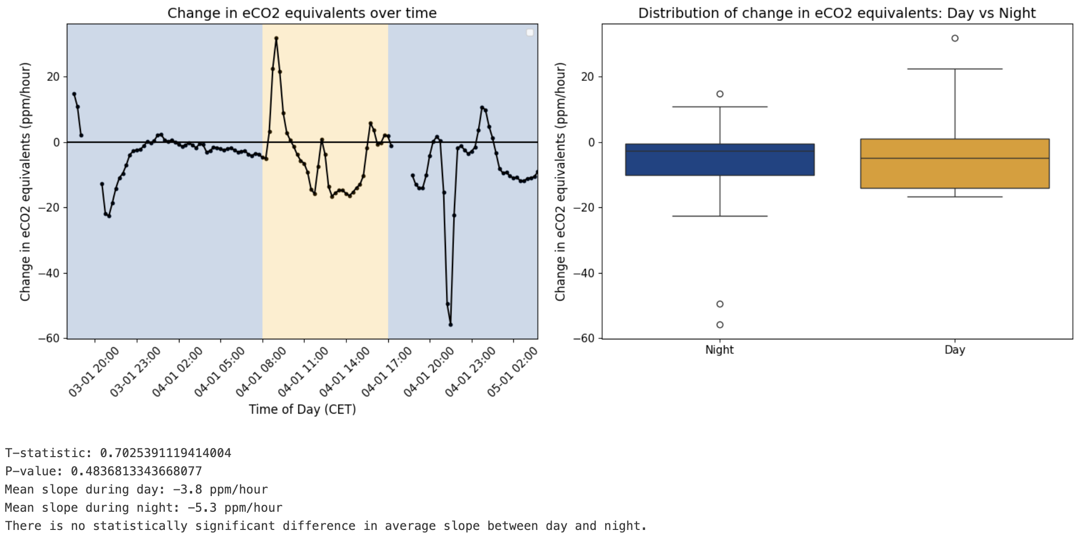
Figure: Evaluation of at what time of the day the air quality or CO₂ equivalents typically change the most.
When multiple effects simultaneously influence a target variable, understanding each variable's individual contribution becomes significantly more challenging. Multiple regression models provide a powerful approach to unraveling these complex relationships. Explainable AI tools, like Shaply values, is one way you could use to make simulations and better understand the sensitivity and feature importance of each variable. If you want to bring it one step further, I could recommend using Prediction Profiler. It’s a specialised feature offered in commercial software of JMP, providing advanced capabilities for model interpretation and optimisation.
Since day and night did not have a significant impact on eCO₂. Now let’s have a look at the effect of the temperature. The second hypotheses states that an higher response is expected at elevated temperatures.
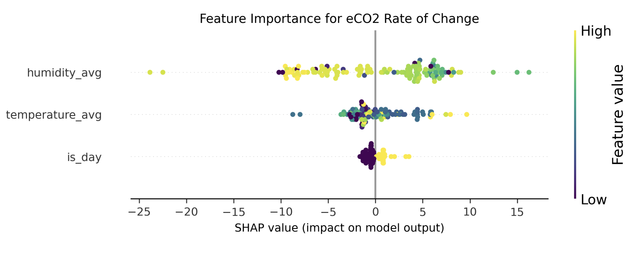
Figure: SHAP beeswarm plot to assess feature importance.
The analysis reveals that relative humidity appears to have the biggest impact on VOC concentration changes rather than the temperature. Specifically, higher relative humidity levels are associated with more significant decreases in VOC measurements. However, the relationship shows inconsistencies, indicating the need for additional data collection and further research to validate these preliminary observations.
Conclusion
While our experimental data did not provide definitive insights about CO₂ fixation or plant health, several key observations emerged.
Data quality is crucial in any data science project and requires ample of attention.
Data visualisation can be a powerful tool for exploratory data analysis (EDA), data quality assessments, hypothesis testing and explaining machine learning models.
While the biggest contributor for influencing air quality was humidity. No significant effect for both temperature and time of the day has been observed.
The ENS160 metal oxide sensor, primarily designed for air quality monitoring, revealed a consistent improvement in environmental conditions over time. Which aligns with broader research indicating that indoor plants can contribute to enhanced air quality (source: ILVO (2019). The air purifying effect of plants). So it’s probably a good idea to have plants around in your home or office for your own health and happiness ;)
Thanks again for sticking with me to the end! Hopefully you learned something. If you have questions or feedback, don’t hesitate to drop me message or leave a comment.
Get in touch and also use these data science optimization techniques and learn how I helped companies save millions.